How to Develop a Living Style Guide
How to Develop a Living Style Guide
Living style guides are a very powerful tool to write clean SCSS code. They simplify the design and implementation of reusable components. On top, you have a very consistent and easy to test style for the web application(s) using the style guide. In fact, a style guide is so easy to develop that I even use one for this simple website. But how do you actually develop a component for a living style guide? This blog post will walk you through the planning and actual implementation, but will not go into the technical details of how to setup the styleguide infrastructure.
Living style guides are an advanced technique to properly structure large amounts of stylesheets, while creating useful documentation. Style guides are usually organized around components, which are shared and reusable parts that are composed to form a usable frontend for a web application. For example, Dropbox uses a living style guide with strict rules to manage its frontend style code base. But for now, lets dive into how we can develop a single component for such a living style guide in 5 simple steps.
1. Component Scoping
A living style guide is made of reusable and flexible components. The most important decision when starting to develop a component for a style guide is to decide what functionality the component actually should have. There is a great article on how a highly reusable component was developed for Facebook’s media object. When designing a component the following questions help lead your thoughts to find valuable insights:
- Purpose: In which situations can the component be used? There should be a couple of use cases for a component.
- Flexibility: Are there similar components that could benefit from a common component? Do content and comments live in a box? Do the header and footer have something in common?
- Composition: What other components can this component have as child? And what child components have to be there? A button may contain icons, a content box may contain anything, but at least have a heading.
- Integration: How should the component align to surrounding components?
- Structure: Can there be a list of components?
Example
As a running example for this blog post, lets look at the box component used throughout this website to host any content:
- Purpose: In which situations can the component be used? The box component must host the main content, for example this blog post.
- Flexibility: Are there similar components? The sidebar on the right contains grouped widgets, for example the latest blog posts or an about me section.
- Composition: Child components? Each box commonly has a title associated to it. The title may contain additional information, such as the time the blog post was written. In addition to that, the box may also have a call-to-action section at the bottom. The content may be anything, from plain text, images, videos, code snippets, you get the point.
- Integration: How should the component align to surrounding components? The box must have proper spacing to structural elements (header and footer) and other boxes.
- Structure: Can there be a list of components? Yes, boxes may represent a list of elements. For example the blog post list.
These are the design constraints used to implement an appropriate HTML and SCSS representation of the box. The example code used throughout this post is compatible with the kss-node living style guide generator.
2. Choosing Elements and Class Names
When having designed the component, we have to think about all the various use cases and how we can model them with specific HTML elements.
Ideally, the HTML elements we choose are flexible.
We should not care whether a button is a <a>, <input type="button"> or <button> element.
Similarly, for our box example we should not care whether we use a <div>, <section> or <article> tag to create the box.
In addition to that, always choose as few elements as possible. That makes it easy to change the markup afterwards and creates simpler templates. Naturally, this depends on the technical possibilities we have with the current CSS standards.
We can model the box requirements from above using the following markup. Of course, we’ll use BEM to create the class names:
/**

Box

A box component is used to host the main content of a web page, for example a blog post. It may also be used to ...

Markup:
<section class="box">
	<span class="box__subtitle">January 01, 1970</span>
	<h2 class="box__title">Living styleguides are awesome!</h2>
	<!-- arbitrary content here ... -->
	<p>They speed up your development...</p>
	<img class="box__media" src="..."/>
	<code class="box__media"></code>
	<video class="box__media"></video>
	<!-- ... arbitrary content here -->
	<ul class="box__actions">
		<li class="box__action"><a href="#!">Create a living styleguide!</a></li>
	</ul>
</section>

Styleguide box.base
*/
As you can see, there are now a couple of different HTML elements associated to the various component class names.
We can build a robust component by also documenting and allowing for the call-to-action elements to use a <div> structure instead of a <ul> structure:
<div class="box__actions">
	<a href="box__action"></a>
</div>
You may also define (and document!) alternatives for other structural elements of the box component, as long as they are allowed to be used and make sense.
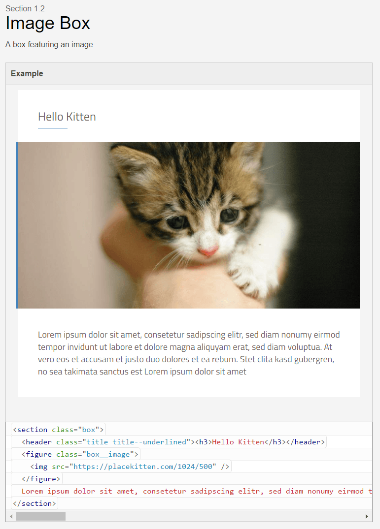
You should also take care to provide good descriptions to your components (and to keep them up to date!). In those descriptions you should write down the constraints identified in the first step that are applicable for the given example. The KSS stylesheet library will then render a living style guide document with the example markup as shown here:
3. Choose Modifiers to Alter the Component State
By using the BEM methodology, we can also design modifiers that change the visual state of the component.
For example, you may alter the state of a simple .button component, by adding .button--active, .button--outline, or .button--secondary states.
Of course, all available modifiers must be documented in the living style guide and all proper living style guide generators allow to define these options in a concise way.
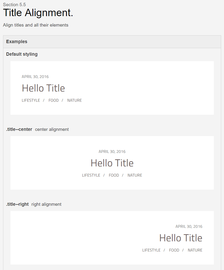
For the box example above, we’ll add modifiers to the box to align its title.
So we define the .box--title-center and .box--title-right modifiers to alter the position of the title of the component.
An alignment could also be applied to the .box__actions element.
Let’s have a look at how the box title modifiers are described in KSS:
/**
Title Alignment

The title of a box may either be aligned to the left (default), centered, or to the right.

Markup:
<div class="box {{modifier_class}}">
	<span class="box__subtitle">January 01, 1970</span>
	<h2 class="box__title">Living styleguides are awesome!</h2>
</div>

Options:
.box--title-center - center alignment of the title
.box--title-right - right alignment of the title

Styleguide box.titlealignment
*/
As you might have noticed, when aligning the title it also makes sense to align the subtitle as well! So the implementation of the above modifiers could look like:
.box {
	&.box--title-center {
		.box__title, .box__subtitle { text-align: center; }
	}
	&.box--title-right {
		.box__title, .box__subtitle { text-align: right; }
	}
}
A quick glance at the generated style guide shows whether the modifier implementation looks good or not:
4. Create Use Cases a.k.a. Regression Tests
Create some examples in the living style guide that comprise typical use cases filled with realistic sample data that your component will have. That makes it easy to spot badly designed parts of the component for its intended usage.
In addition to that, you can also add examples covering edge cases of your component usage. For example, when designing titles, make sure to include an example featuring a very long title to see how the component might handle that case:
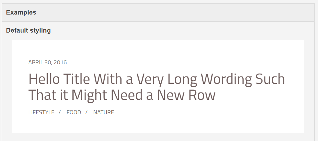
In addition to that, these use cases can also be seen as regression tests. As long as they still look good, most parts of your application should look good as well!
5. Create Integration Scenarios
A single web site is composed of multiple, nested components. When implementing components in a living style guide, it is also of high importance to keep the integration of the components in mind. Do the built components actually work together to compose a harmonic design?
You can verify that by creating documentation containing integration scenarios. Such a scenario could be
- a full-featured blog post.
- the page structure (header, footer and some dummy content in between).
- a list of components with pagination, filtering and/or sorting.
The possibilities are endless, but should remain close to the actual usages in your project. After changing existing rules, you can easily verify their impact on these important integration scenarios.
Conclusion
Developing a component for a living style guide requires some thought, some planning and some means to write all the required KSS documentation. In the long run, having an up-to-date living style guide has numerous benefits and especially minimizes the risk of design changes. What experiences did you make with living style guides in your project?